
The No-Stress Way To Turn Simple Templates Into Premium-Feeling Downloads
If you are a creator, coach, freelancer, or small business owner, you probably live inside Canva, Google Docs, Notion, or PDFs. You make checklists, planners, scripts, trackers.
Then you ask yourself the painful question: “Can I actually charge money for this?”
The truth is, all you need is just the simple framework that makes your premium-feeling downloads look and feel like they came from a real brand, not a random freebie folder.
This guide gives you that framework.
Step by step, beginner-friendly, repeatable.
What Makes a Simple Template Feel Premium

I still remember the first time I tried to sell a Canva template.
I spent an entire Saturday tweaking pastel colors, swapping fonts, nudging boxes one pixel at a time. By the end, my eyes hurt, my coffee was cold, and I was convinced I had built the Mona Lisa of content planners.
It sold for 7 dollars.
Two weeks later, a friend launched a “boring” Google Doc checklist. No fancy graphics, no gradients, zero sparkles. Clear steps, neat layout, one strong promise. She priced it at 27 dollars and it sold all weekend.
That was the punch in the face I needed.
You do not need to be a designer or spend 10 hours per file to make a simple template feel premium. You just need a clear promise, calm layout, and a few small details that scream “I know what I’m doing”.
This guide shows an easy, repeatable system you can use on any Canva, Google Docs, Notion, or PDF template so it feels like a luxury download, not a cheap freebie.
Premium-feeling downloads solve a sharp, specific problem
When people say “premium,” they picture crazy gradients, animations, and intricate icons. That is how you burn time, not how you build value.
In practice, a premium-feeling template does three things well:
- It solves one sharp problem,
- It feels easy to follow, and
- It looks quietly consistent.
Let’s break that down.
High-value templates do not try to fix someone’s entire life in one file.
They promise one clear win, like:
- “Plan your weekly content in under 30 minutes.”
- “Outline your launch email sequence in one afternoon.”
- “Track your weekly expenses in five minutes a day.”
Compare these:
- Unfocused: “Online Business Toolkit” with random pages for content, mindset, passwords, habits, and grocery lists.
- Focused: “30-Day Launch Content Planner” that walks through day-by-day posts for one launch.
Or:
- Unfocused: “Student Life Master Spreadsheet” with grades, chores, meal ideas, workouts, affirmations, and a vision board.
- Focused: “Semester Study Tracker” that handles classes, due dates, and study hours only.
The focused version feels more premium because buyers instantly know what result it gives. They are not paying for a giant folder of “stuff”, they are paying for a clear outcome.
Clean structure and flow beat complex visuals
People judge your download in about three seconds.
If their brain goes, “Ah, I see what to do here,” you win. If it goes, “What is all this?” they click out, no matter how pretty the graphics are.
Simple, premium-feeling structure looks like:
- Clear sections. Headings like “Brainstorm,” “Plan,” “Review,” instead of random bold words.
- White space. Breathing room around boxes so the page feels calm, not crowded.
- Short instructions. One-line hints like “Write your ideas here” or “Pick your top three” instead of paragraphs of theory.
Think of your template like a tiny guided path. The user should always know what the next step is, without needing a YouTube tutorial to figure it out.
Tiny details that make your download feel Premium
This is where people underestimate how simple “premium” can be.
Small signals that upgrade the feel:
- Page numbers. Bottom corner is fine; it tells people this is a complete product, not some random page you exported in a rush.
- Consistent margins. Text boxes and elements line up, instead of floating near edges.
- Font hierarchy. Same font and size for all headings, same for body text, same for buttons or callouts.
- Simple cover page. Title, subtitle, your name or brand, and that is it.
- Quick-start page. A “Start here” page that shows how to use the file.
Individually, they look small. Together, they make your template feel like it came from a real brand, not a last-minute school project.
When your template solves one clear problem, it feels like a tool, not homework.
Step-by-Step: Turn Any Basic Template Into a Premium Download

Here is the no-drama workflow you can reuse for every Canva, Docs, or Notion template.
Step 1: Narrow the promise of your template to one clear win
Before you touch fonts, set the promise. One sentence, one win.
Examples you can steal:
- “Plan 30 days of Instagram content in 1 hour.”
- “Track every dollar of your weekly budget in 5 minutes a day.”
- “Map your entire launch in one afternoon.”
- “Reset your Sunday night routine in 20 minutes.”
- “Turn messy class notes into a clean study sheet in 10 minutes.”
This promise shapes your title, your cover, and your instructions. If a section does not support the promise, cut it or save it for another product.
Step 2: Choose 2 fonts and 2 colors to keep everything consistent
Design does not start with “Which of these 42 fonts feels fun today?”
Use this simple combo:
- Fonts:
- One bold sans serif for headings (like Montserrat or Poppins).
- One clean sans serif for body text (like Open Sans or Lato).
- Colors:
- One main brand color.
- One neutral or soft accent.
Safe, easy pairs:
- Navy and beige.
- Black and soft gray.
- Dark green and cream.
- Deep plum and light blush.
Use the main color for headings, buttons, or key shapes. Use the neutral for backgrounds, lines, and soft highlights.
Consistency looks premium. Five colors and four fonts look like chaos.
Step 3: Add a simple cover page that sells the result, not the file
This is where many creators get shy and boring.
“Content Template.”
“Budget Sheet.”
“Planner.”
That is not a title, that is a label.
Try this structure instead:
- Strong title that speaks to the promise.
- “30-Day Content Planner For Busy Service Providers”
- “Weekly Zero-Based Budget Tracker”
- “Semester Assignment Control Center”
- Short subtitle that explains the outcome.
- “Plan one month of posts in under an hour.”
- “Know where every dollar goes, before you spend it.”
- Creator name or brand in small text at the bottom.
Keep the cover clean. One main color block, one font for the title, maybe a subtle shape or line. That is enough.
The goal is not to show your entire style range on one page. It is to make someone think, “Oh, I know exactly what this will help me do.”
Step 4: Create a one-page quick-start guide inside the download
Most buyers will not read a long PDF manual. They will open the file, click around for 20 seconds, and decide if they will actually use it.
A one-page quick-start buys you that “Yes.”
Include:
- Who it is for.
“This template is for busy coaches who want to plan their weekly content fast.” - What it helps them do.
“By the end of this planner, you will have 30 days of posts written and scheduled.” - Three simple steps.
- Step 1: Brain dump ideas on page 3.
- Step 2: Use page 4 to map content by day.
- Step 3: Use page 5 to track what is posted.
Add a tiny FAQ box at the bottom:
- “How do I edit this?”
- “Can I print it?”
- “How do I duplicate pages?”
You just turned a plain file into a guided tool. That is what people pay for.
Step 5: Clean up the layout so every page feels calm and easy to use
Now you polish.
Go page by page and:
- Align text boxes. Use align tools in Canva, Docs, or Notion so titles and sections line up.
- Use even spacing. Same gap between sections, same padding in boxes.
- Limit each page to one main idea. If you are squeezing five processes onto one page, split them.
- Add clear section headers. Simple phrases like “Step 1: Ideas,” “Step 2: Plan,” “Step 3: Review.”
- Leave white space. If your page looks full, remove a decorative element instead of shrinking text.
You can use thin line dividers or soft shaded boxes to group related areas. Think “calm workbook,” not “Vegas billboard.”
Busy and loud looks cheap. Calm and simple looks expensive.
Simple Polishes That Instantly Upgrade Your Template’s Value

Once your base template is solid, a few quick extras will take it from “nice” to “I would pay for this again.”
Add short, friendly microcopy that guides people as they use it
Microcopy is the tiny text that tells users what to do.
Instead of a blank box that says “Ideas,” try:
- “Brain dump every content idea here, even the messy ones.”
- “List every bill that hits your account this month.”
- “Write all your exams and due dates for this week.”
These prompts do three things:
- Stop the “What do I put here?” freeze.
- Make the template feel like a guided session with you.
- Increase the chance they finish the process and see results.
A template with helpful microcopy feels like support, not homework.
Use checklists and progress markers to help users feel wins fast
People love to feel like they are making progress. They also love to check boxes. Use that.
Ideas:
- A small “Before you start” checklist on the quick-start page.
- “Open your calendar.”
- “Gather your logins.”
- “Pick your time frame.”
- A “You are here” bar on multi-step planners:
- Step 1: Brainstorm
- Step 2: Plan
- Step 3: Implement
When someone can see where they are, they are more likely to keep going. When they finish a checklist, they feel the product “worked,” even if that checklist was simple.
That feeling sells.
Include a resources or bonus page that adds helpful extras
You do not need a 20-page bonus. One strong page is enough.
You could add:
- A list of tool ideas or links.
- A few example prompts for content or journaling.
- A sample filled-out page so they can “copy the pattern.”
For example, a content planner might include a page with 10 caption hooks. A budget sheet could have three example categories for beginners.
The goal is to make them say, “Oh, that is helpful, I did not expect that,” not, “Why is there a 10-page essay in my planner?”
Brand it lightly so it feels custom but not cluttered
Yes, you want your name on it. No, you do not need to plaster your logo in every corner like a sports jersey.
Simple branding:
- Small logo or name in the footer.
- Website or handle in small text.
- Brand name on the cover and quick-start page.
Avoid huge watermarks or loud branded banners that steal space from the actual content. Subtle branding feels confident. Heavy branding feels insecure and a bit cheap.
Package, Price, and Present Your Premium-Feeling Templates With Confidence
You have a solid, premium-feeling template. Now it is time to package and sell it without spiraling about price or format.
Export formats that feel polished and are easy to use
Match the format to how people will use the template:
- PDF: For worksheets, planners, and trackers that people print or fill with a PDF editor.
- Editable link (Canva, Google Docs, Notion): For templates people will copy and customize online.
- Both: For high-value products, share a PDF overview plus an editable version.
Keep it tidy:
- Use clear file names: “30-Day-Content-Planner.pdf” instead of “Final_v7_NEW_REAL.pdf.”
- If you have multiple files, zip them or include a simple folder structure.
- Add a short “Read me first” PDF if there are links or tech steps.
Your buyer should never wonder, “Which file do I even open?”
Write a product description that highlights outcomes, not page count
“Includes 17 pages, 3 color themes, and 4 checklists” is nice. It is not why someone pulls out their card.
Use this simple formula:
- Who it is for.
“For busy service providers who hate staring at a blank caption box.” - What problem it fixes.
“No more guessing what to post or when.” - What result it gives.
“Plan 30 days of content in one focused hour.” - How fast or easy it is.
“Just follow the 3 simple steps inside.”
That is the copy that sells a premium-feeling product, even when the file itself is simple.
Set a stress-free price by matching value to one clear result
Pricing is where a lot of creators start mumbling and changing numbers three times a day.
Here is a calmer way to think about it:
- If your template solves a tiny task (like a one-page checklist), that is a lower price.
- If it supports a whole workflow or transformation (like a full launch planner or client system), that is a higher price.
Ask yourself:
- How much time does this save them each week or month?
- How much money could it help them earn or stop wasting?
- How much stress or decision fatigue does it remove?
Pick a price that feels a little stretchy, but not panic-inducing. Then leave it there long enough to collect reviews and data. You can always raise it as proof builds.
Forget perfection. You are allowed to adjust.
I learned all of this the slow way, but you can have the done-for-you version
I wish I could say I figured this out in a weekend. I did not. I spent months tweaking colors at 1 a.m., reading design blogs I barely understood, and wondering why my “pretty” files still did not sell.
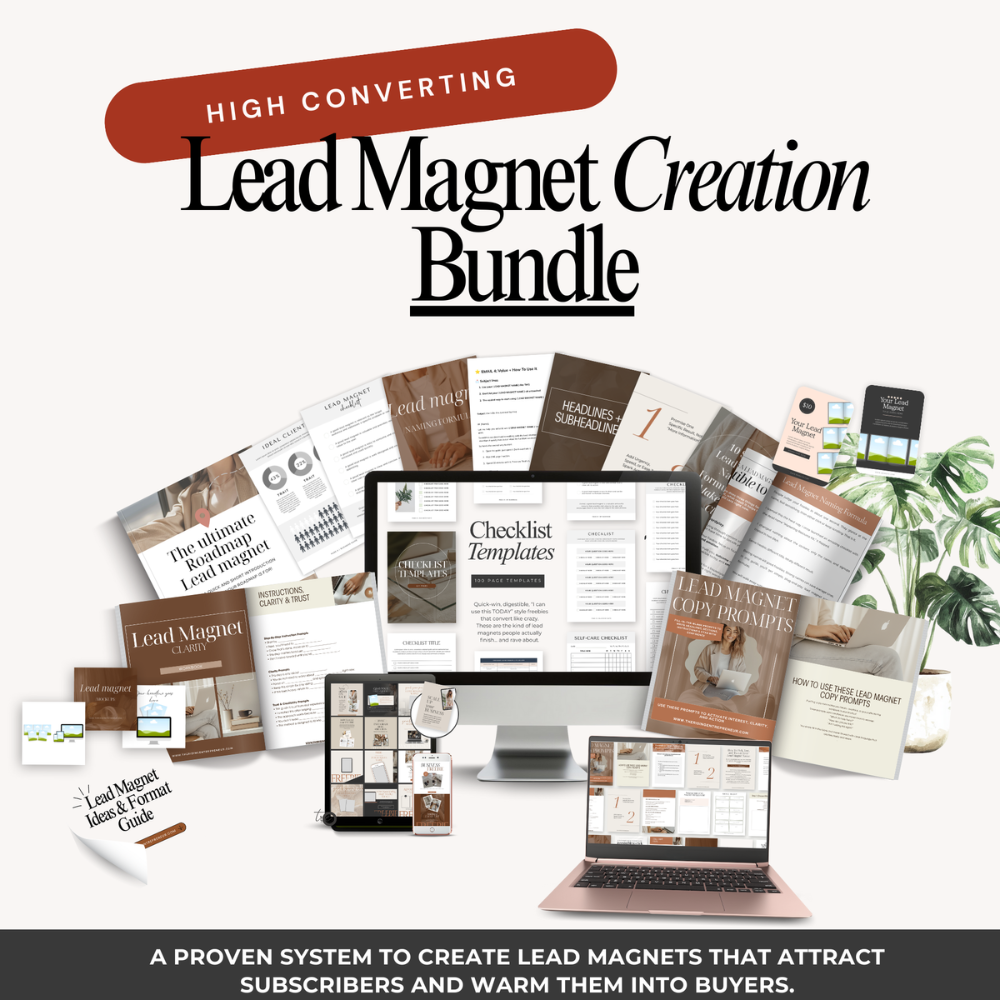
That annoyance is exactly why the Lead Magnet Creation Bundle exists.
This bundle gives you the complete done-for-you version of what you just read. You get:
- A clear framework that walks through this system in more detail
- Ready-to-use templates that already follow the premium rules
- Plug-and-play text blocks, layout patterns, and page ideas
- Everything you need to get that premium look without guessing
If you like the ideas in this post but want the shortcut instead of the messy, slow route I took, that bundle is the fast track.
High Converting
Lead magnet creation bundle


Conclusion
You do not need wild design tricks to make simple templates feel premium. You need a clear promise, a calm layout, and a thoughtful user experience.
The core moves are simple:
- Narrow the promise to one clear win,
- Set a tiny style system of 2 fonts and 2 colors,
- Add a clean cover and one-page quick-start guide,
- Tidy the layout, and
- Layer in small pro touches like microcopy, checklists, and light branding.
That is how a basic Canva file starts to feel like a premium download.
Pick one template you already have, even if it feels a bit embarrassing right now.
Run it through the steps in this guide today. You will be shocked at how different it feels with just an hour of focused upgrades.
Next week, the process will feel easier. A month from now, you will have a whole shop of templates that look and feel high value, built without burning yourself out over tiny pixels.
Premium is not about perfection, it is about care and clarity.